Festive Friday Challenge #FF0158, Double Trouble Challenge #164, and Crafter’s Cafe Challenge #307

https://festivefridaychallenge.com

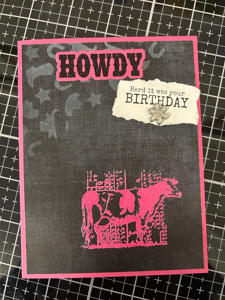
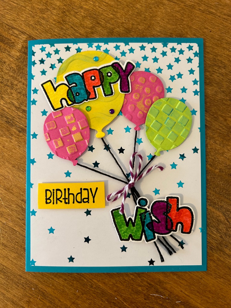
Challenge elements used: pink, metallic element, paper tearing, birthday sentiment

https://doubletroublechallenge.blogspot.com

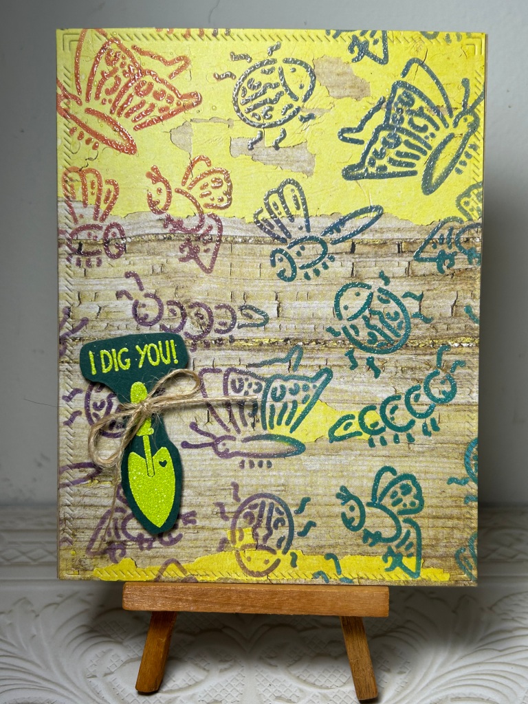
Challenge elements used: Thing 1 Clean and Simple, Thing 3 a color other than white in the background, Thing 2 enter into the Crafter’s Cafe Challenge

https://crafterscafeblogchallenge.blogspot.com/2024/04/307-cas-clean-and-simple.html

Challenge elements used: clean and simple

The stamp sets used for this card are Unity Stamp Company “Holy Cow”, and scrapbook.com “Howdy”. The stencil is “Rodeo” by Maker Forte.

Double Trouble Challenge #163

https://doubletroublechallenge.blogspot.com

The challenge elements were to use something recycled or Kraft card stock, and the color blue. I was rummaging through my saved boxes (which I use mainly as reinforcement or to add thickness) for another project when I ran across this Trader Joe’s box from their delicious Dark Chocolate Stars cookies. At first I was focused on the back side which is a beautiful Kraft color…and then noticed that the front was full of blues! Other than having this challenge on my mind, never in a million years would I have thought to use the front side of the box.

The cover plate die I used to make the card is Color Block Southwest from Spellbinders. I cut it once using the front of the box and then again using the back side of the box. Then I cut it a third time using the solid blue colored paper and used a mixture of them all for the card front. Thank you for the challenge! I will hopefully remember for the future that the front sides of boxes are fair game. 🙂

March ATC class

This is one of my favorite techniques so far! The theme is Tattered Floral. We used Distress Inks (no oxides). The first thing we did was smoosh our full sheets of white card stock with Old Paper ink. Once it dried, we cut to ATC size. Then we used Rusty Hinge to stamp on with a script style stamp. Then we stamped on the floral image with black archival ink. Next, we used diluted distress inks with water brushes to paint the images (these are Prize Ribbon, Picked Raspberry, Broken China and Mowed Lawn). Once completely dry, we blended around the edges with Scattered Straw. I love how they look like they are old and worn! To balance the bottom of the card with the floral image above, I used a paper punch then mounted them on gold card stock. I definitely want to try this technique for a card front.

Festive Friday Challenge #FF0156

https://festivefridaychallenge.com

Challenge elements used: wood grain, twine, insects

I recently got the Simon Hurley stencil Cordial Critters and was excited to have a chance to use it! The background is a printed paper, and I used Distress Oxide inks in 4 colors with the stencil, then clear embossed over it. They were so cute I didn’t want to cover them up, so I found a very small sentiment to use from Stampin’ Up “Tag It” stamp set. It is embossed with Sizzix powder in “Pear”.

Double Trouble Challenge #162 and Beautiful Blossoms Challenge #15

https://doubletroublechallenge.blogspot.com

https://beautifulblossomschallenge.blogspot.com/2024/03/beautiful-blossoms-challenge-anything.html

Thing 1: make a project using a favorite floral image, and Thing 2 double dare: also enter it in the Beautiful Blossoms challenge.

This project was made using the Altenew Bold Bouquet stamp and stencils. The edger is an LDRS Creative diagonal stitched card topper. The inks are also LDRS with gel pen accents.

Update: This card was selected as a Top Four favorite in the Double Trouble Challenge!

Festive Friday Challenge #FF0154 and Double Trouble Challenge #161

https://festivefridaychallenge.com

https://doubletroublechallenge.blogspot.com/?fbclid=IwAR0-_4oa_isr3_lEQVF0COsgabxIqPmZ2CKSxZdbssYkpgqrcqi0RQ2Un3k

Challenge elements used: green, gold, rainbow, gold embellishments.
The background is a BoBunny newsprint stamp, then ink blended with some various blue and green oxide inks. The rainbow is stamped on with oxide inks. The bird is made from Tim Holtz stamp and die, Bird Crazy. The stencil and cloud dies are Lawn Fawn, with Simon Hurley Lunar Paste.

As soon as I finished it, gave it to my husband for his birthday. 🙂

Update: This card was selected as a Top 5 favorite in the Double Trouble challenge!

Festive Friday #FF0153

https://festivefridaychallenge.com

Elements used: blue, white, pink, glimmer, bouquet, supportive sentiment

Background is water colored, and then added some Pixie Sparkles in Beyond Blue for the glimmer. The bouquet stamp and die, sentiment stamp and die, tag die and twine all came from the February Hero Arts monthly subscription. It was perfect timing! I used oil based colored pencils to color the bouquet.

Update: This card was selected by the judges as a “top 3 favorites” of all submitted for this challenge. Yay!!

February 2024 ATC Class

The technique was layering some ink, then embossing on another ink color with an embossing folder, and then using a stencil butter or wax to highlight the impressions even more. And of course, adding on a layer of sparkle/shimmer just for the fun of it. 😀 There really wasn’t a theme other than spring colors.

Festive Friday Challenge #FF0152

https://festivefridaychallenge.com

Challenge elements: balloons, bright colors, texture, twine, large sentiment (the lettering on the sentiment also reminded me of balloons)

The background is a Pink and Main Falling Stars Foilable, with Lagoon cheer foil. The balloons are a scrapbook.com die set, and the sentiment is Taylored Expressions “Wish Big”. 

Update: This card was selected by the judges as a “top 3 favorites” of all submitted for this challenge. Yay!!

January ATC Class

The technique was “spotlight”, by using a 1 inch square on a background. It could be contrasting patterned paper, stamped images (stamped on neutral paper, with contrast of same stamp on colored paper or gel plate pull), etc. and matching up the image on the background.  I used an open stamp on patterned paper, then stamped duplicates on white paper and colored them in. The white paper, even with the objects colored in, didn’t “pop” as much as I wanted it to against the background, so then I used some oxide ink to add a blue tint to the squares before adhering them.  

Festive Friday #FF0150

Elements used: Red, gold, layers. For the background, I heat embossed white onto white card stock. Then I used 3 colors of red alcohol ink, as well as metallic gold. Then, in order to see the white embossing, I used Tim Holtz alcohol lift ink on a q-tip. Note: This worked great on regular card stock. When I tried to replicate it on Yupo paper, the lift ink on q-tip didn’t work. 

December ATC Class

We got to choose our technique, and the theme was “sparkle” and winter. My background was alcohol ink with glitter additive. The trees are stamped in distress oxide inks and fussy cut. The snow is texture paste then covered in gesso after it dried to make it whiter. Snow flakes are stamped and heat embossed with a sparkle embossing powder.

November ATC Class

We used gel plates, acrylic paint and stencils to make fodder for our card bases. The goal was to layer patterns and colors. Then we added more layers to the cards by tearing a different fodder sheet. The theme was art and creativity.

October ATC Class

Well, I missed this class because we were in Arizona…but doing it as homework now. The technique is tissue paper adhered to playing cards. The theme was whatever we wanted it to be based on our supplies. I thought I would use the front of the playing cards but I ended up using the back instead. Most of the other supplies came from stash sales!

September ATC Class

We layered acrylic paint, distress inks and I finished mine with an ink spray, to mimic water/ glass rings. I can’t believe how real it looks! Then we picked a beverage as a theme for the cards. This is one of my favorite ones so far!

Halloween Gift Tags

I made these last weekend while we were away for the weekend visiting family as a little travel project. I’m getting very interested in tags, and these were a good trial run. I’m hoping to make larger ones to display for holidays and have been watching some videos for ideas.

Festive Friday Challenge #FF0141 & Double Trouble Challenge #146

Festive Friday Challenge elements used: pastel colors, pearls, texture, sand, shells

I realize that “sand” didn’t mean actual sand…however, I was really curious to see if it was possible to use real sand and what it would look like. This is sand and glitter mixed with collage medium and spread onto the paper. Thicker paper would have worked better, but the result was pretty cool! For the shells, I used alcohol inks and some stamp sets, but then couldn’t resist adding one real shell.

Graduation

My nephew graduated with a Bachelor’s degree and my daughter graduated with an Associates Degree in May. Here were their cards, both made using the LDRS ledger stamp and coordinating celebration stamp set “On This Special Day”.